AskSia

Question
Microeconomics
Posted almost 2 years ago
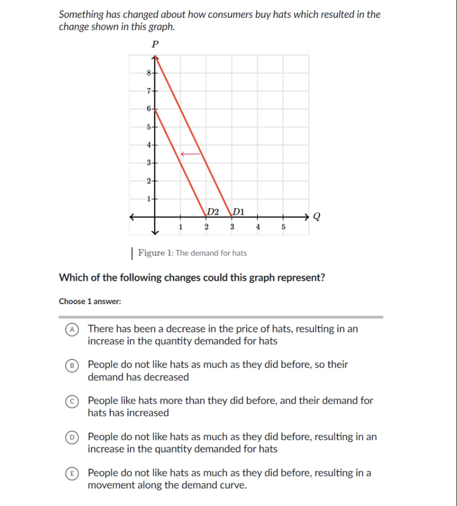
Something has changed about how consumers buy hats which resulted in the change shown in this graph.
Figure 1: The demand for hats

Which of the following changes could this graph represent?
Choose 1 answer:
(A) There has been a decrease in the price of hats, resulting in an increase in the quantity demanded for hats
(B) People do not like hats as much as they did before, so their demand has decreased
(c) People like hats more than they did before, and their demand for hats has increased
(D) People do not like hats as much as they did before, resulting in an increase in the quantity demanded for hats
(E) People do not like hats as much as they did before, resulting in a movement along the demand curve.

Answer from Sia
Posted almost 2 years ago
Solution
a
Law of Demand: The law of demand states that, all else being equal, as the price of a good decreases, the quantity demanded increases, and vice versa
b
Graph Analysis: The graph shows a leftward shift from D1 to D2, indicating a decrease in demand. This is not a movement along the demand curve but a shift of the entire curve
c
Decrease in Demand: A leftward shift in the demand curve (from D1 to D2) suggests that consumers are now willing to buy fewer hats at each price level than before
d
Correct Option: The correct answer is (B) People do not like hats as much as they did before, so their demand has decreased
Answer
(B) People do not like hats as much as they did before, so their demand has decreased
Key Concept
Demand Curve Shift
Explanation
A leftward shift in the demand curve indicates a decrease in demand, meaning consumers are less willing to buy the product at any given price. This is different from a movement along the demand curve, which would be caused by a change in the price of the good itself.
Not the question you are looking for? Ask here!
Enter question by text
Enter question by image
Unlock Smarter Learning with AskSia Super!
Join Super, our all-in-one AI solution that can greatly improve your learning efficiency.
30% higher accuracy than GPT-4o
Entire learning journey support
The most student-friendly features
Study Other Question